
Charter service
Trip.com is the biggest online travel agency in Asia with 400 million+ users.
TYPICAL USER
Chinese 31-55 years Middle class
SCENARIO
Reserve charter service for travel or business
GOAL
Increase order conversion rate
MY ROLE
Product design
TEAM
PM Frontend Dev Backend Dev
TIMELINE
2 months
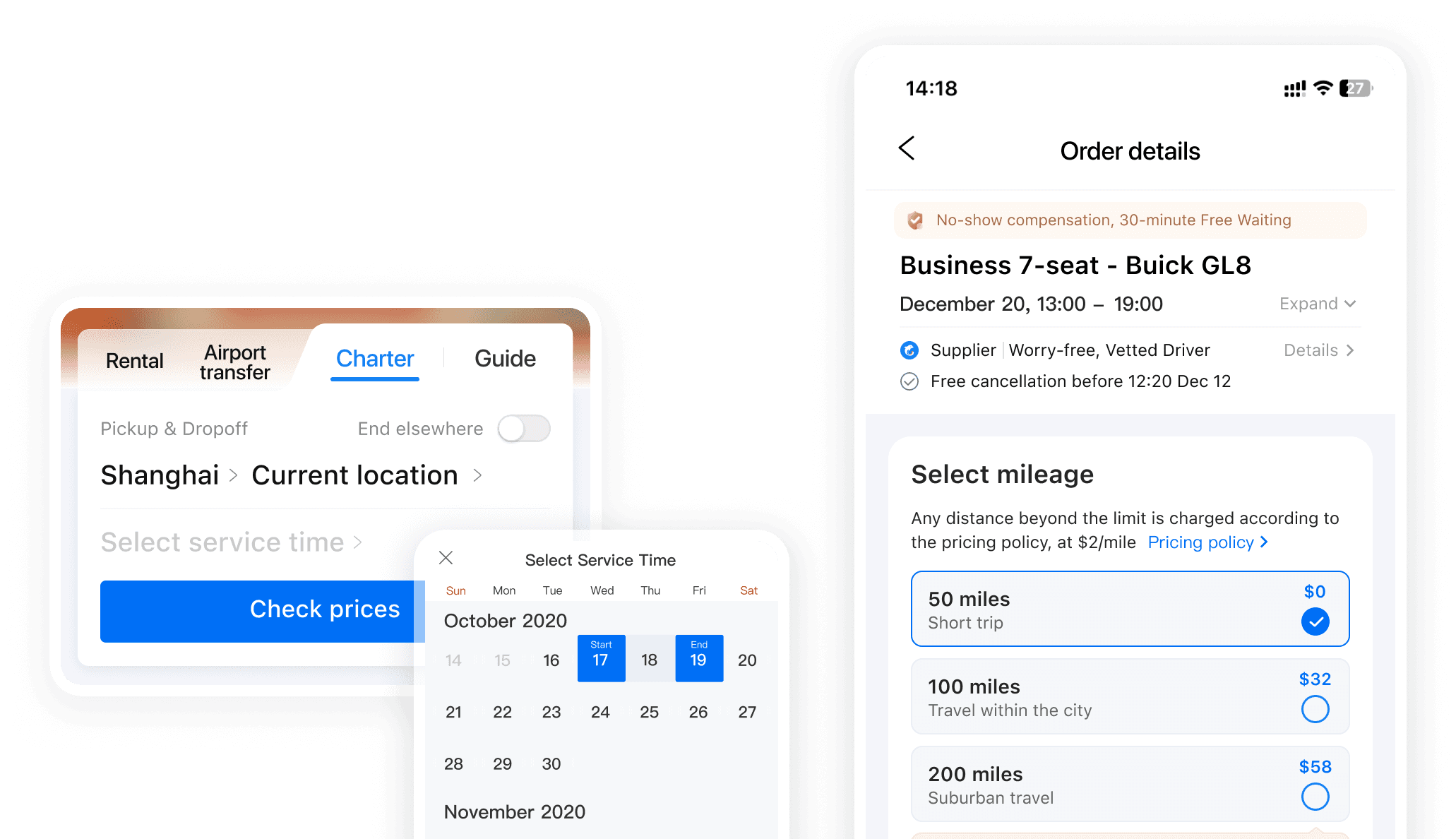
What is charter service?
The status quo

Aligning goals

Hypothesis - Users having a hard time selecting package?
Define challenge with data & research

Reframing the challenge
The issue isn’t just the package,
it’s deciding on the miles.
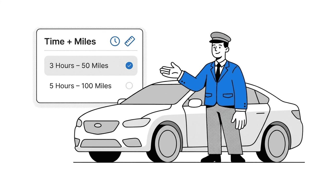
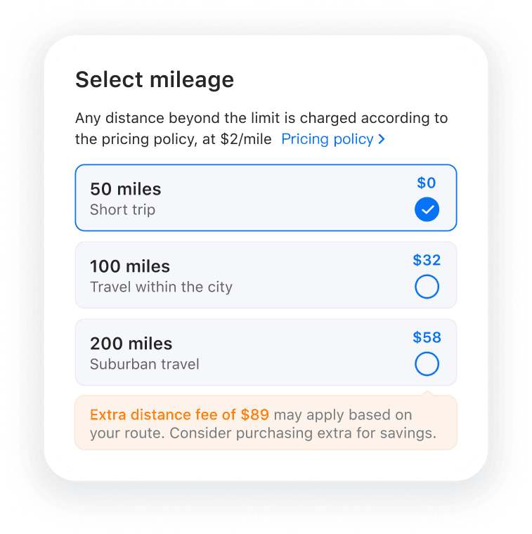
Separate package to reduce cognitive load
Leverage scenarios to reduce learning cost
Impacts
Order conversion rate
11.3%
GMV
4.88%
Prices dropped as users chose shorter times to match their true needs
Challenge 2
Confusion and Frictions

New users want to check products ASAP
Usability testing revealed that users often rush to the list page to understand the service, sometimes entering a fake destination just to get there quickly.
Design approach
Shorter flow for prices
Reduce visual noise and confusion by replacing destination with a switch; When no fields are filled, clicking "check prices" should directly trigger a pop-up.

Before

After
Impacts
Order conversion rate
13.9%
Challenge 3
Information chaos

Design approach
Reorganize Info & Reduce visual noise


Impacts
Order conversion rate
3.5%
Overview
Order conversion rate
31.9%